Informational - Brochure Websites
Case Study: leansellingsystem.comInformational / Brochure Websites seem like the simplest type of websites and there are bunch of WYSIWYG editors to build these kind of websites. It seems “that easy” to build a website for your business. However if you ever tried to build a website, you know that it’s not the case. There are several roadblocks and they are not easy to overcome if you’re inexperienced.
“…an outstanding product with very little direction. Extremely responsive in addition to being very fast, with a great artistic eye for color and layout…”
Robert P.
Challenge: Data Organization
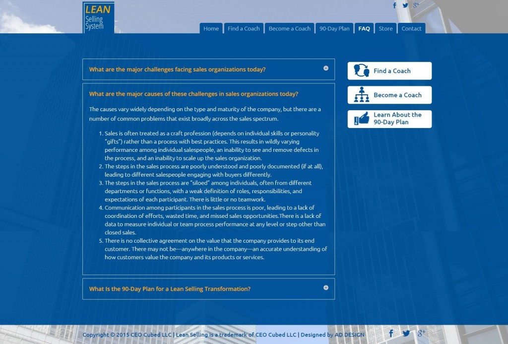
This step is the core of an informational / brochure type website but it’s usually overlooked by inexperienced web designers/developers. Categorizing the data and presenting it in a meaningful way isn’t short of an art form. The message should be presented in an efficient and effective way.
Our Solution
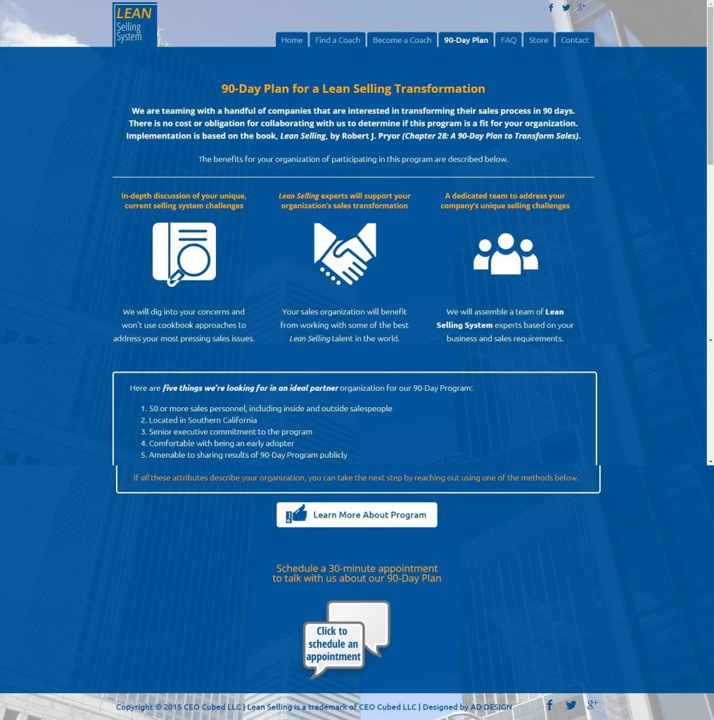
When you visit leansellingsystem.com the first thing you’ll see is what the website is about. Just below that we summarized the three ways the visitors can benefit from the website. The information is presented in a clean, easy to understand way which immediately prepares the visitors for the next steps. The navigation menu of the website is also intuitive and straightforward. Overall the website doesn’t leave any question marks in the visitors mind.
Challenge: Design
Shapes, colors, lines, fonts.. They all tell stories and we interpret them in the subconscious level. A webdesigner needs to make sure that they’re all telling the story of the website, not their own.
Our Solution
The website is introducing a selling system which is about cutting the unnecessary aspects of a sales system. So we came up with a pretty simple design including only 3 colors, 2 fonts, some basic icons and a few lines. The blue background over corporate buildings sends the message of confidence, trust and transparency. When we started to describe the system a little bit in detail further down the homepage, we used big numbers in circles. This created a subconscious message of elementary grade math. By associating the unknown sales system with simple math, we achieved our desired effect of introducing a new concept to the visitor without scaring him. And yeah, they also look good.