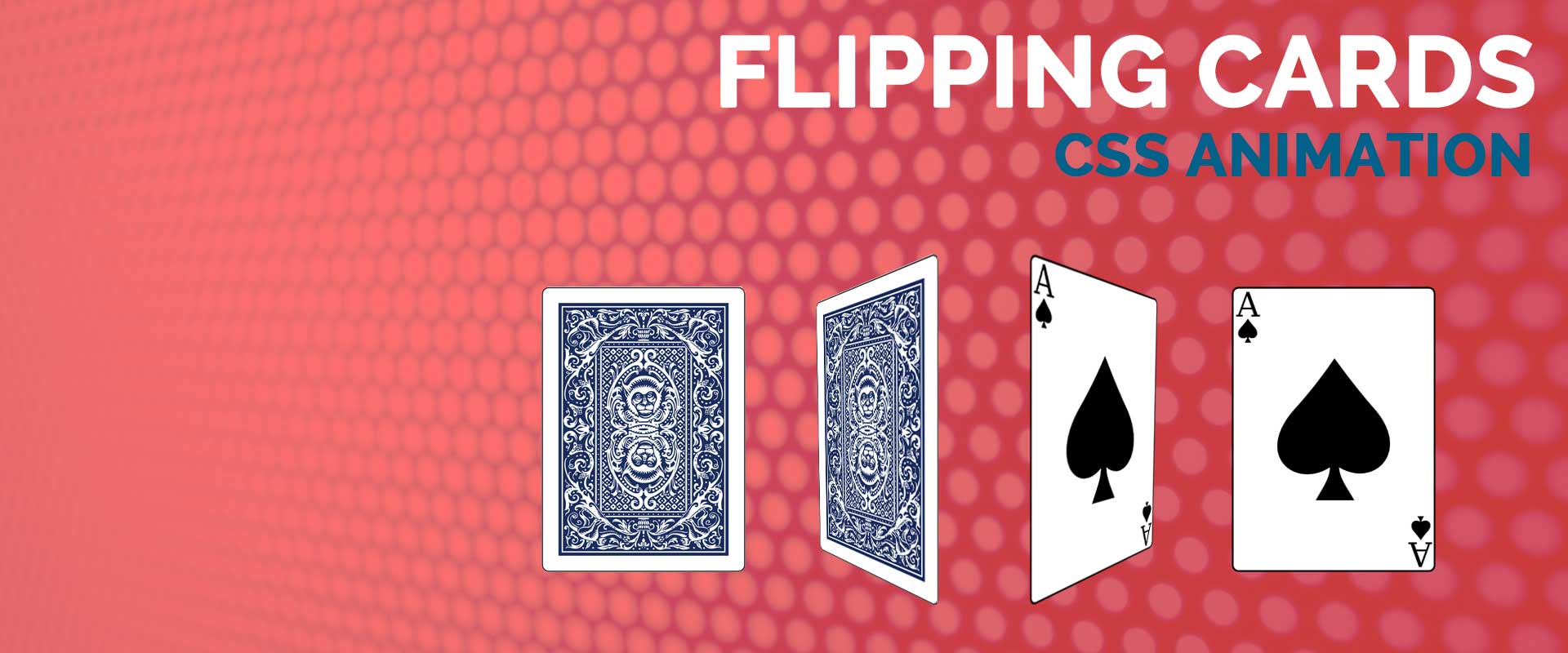
Today I had to create a simple flipping cards CSS animation for one of my clients because of the layout concerns.

We had the slider on top, services area after that and our H1 and main explanation followed these two sections. We wanted to keep the H1 and the main explanation above the fold so we didn’t have space for the explanations of the services. For the services section, we were supposed to use just 150px.

So we decided to do this with a flipping card animation. We put our icons and the name of the services in front of the card and the brief explanations with the links at the back. When you hover over an icon, there was a card flipping effect.
Pro Tip: Use this animation when you have space constraints.
Core HTML
In our basic HTML code, first we’ll create the div for the card and then the front and back divs of the card.
<div class=”card”>
<div class=”front”></div>
<div class=”back”></div>
</div>
I’m not going to fill in the rest of the html code here, you can change it according to your needs. Just put whatever you need in the front and at the back of the card.
CSS Magic
The secret of the animation is in the CSS code. First we dealt (with) our cards.
.cards {
display: inline-block; /* This is going to center the cards and line them up horizontally. */
}
Then we positioned the front side accordingly.
.front {
position: absolute; /* This makes sure the back side will be on top of the front side. */
transform: none;
transition: 0.7s all ease-in-out; /* This is about displaying the trick slow enough to wow people */
}
And this is obviously followed by the backside.
.back {
transform: rotateY (-180deg); /* To create the flipping effect, the starting position of the backside should be reversed. */
opacity: 0; /*We don’t want to show the backside initially. */
transition: 0.7s all ease-in-out; /* This is about displaying the trick slow enough to wow people */
}
The card trick starts when you hover on the card. We need to make the front side disappear and back side appear at the same time.
.card:hover .front {
transform: rotateY (-180deg); /* To create the flipping effect, the position of the front side should be reversed. */
opacity: 0; /* And it should disappear */
}
.card:hover .back {
transform: none /* Taking back the initial revert */
opacity: 1 /* And making the back side appear again */
}
A nice, useful card trick. We had some other adjustments for our code but the main code which does the trick is this.
Pro Tip: You can create a beautiful portfolio gallery with this animation.
Just give me the code
If you want to miss my hilarious writing, you can just copy&paste the HTML and CSS codes here and adjust them according to your needs: